Francis W. Parker School Kovler Family Library
Eckenhoff Saunders
Honorable Mention 2020 Education Design Showcase
Project Information
Facility Use: Elementary, Middle and High school
Project Type: Renovation
Category: Libraries/ Media Centers
Location: Chicago, IL
District/Inst.: Francis W. Parker School
Chief Administrator: Dan Frank, Principal
Completion Date: September 1, 2018
Gross Area: 9,620 sq. ft.
Area Per Student: 36 sq. ft.
Site Size: 5 acres
Current Enrollment: 940
Capacity: 267
Cost per Student: $4,042
Cost per Sq. Ft.: $395
Total Cost: $3,800,000
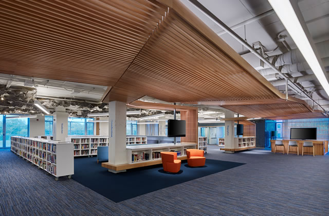
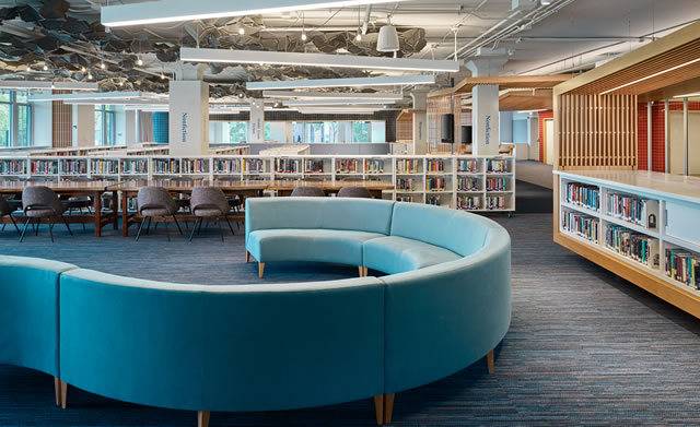
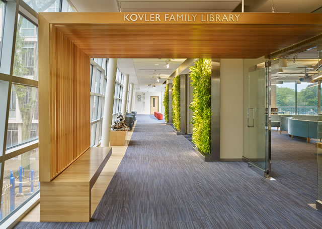
The library's transformation is immediately evident as students no longer enter a narrow corridor but instead enter a lush new gallery planted with green walls, furnished with comfortable seating and populated with the school's sculpture collection and student art. No longer hidden from view, the corridor wall has been replaced with operable glass partitions thrown open throughout the day, making corridor and library one free-flowing space and inviting in all who pass through. Daylight from the once contained corridor floods the space while library seating and study space spills out.
The library is organized using a freeform millwork "tree" that folds organically through the space first as ceiling, then floor, then furnishing. At various places, this meandering element creates "Genius Hubs" where students engage with each other and the librarians, a video conferencing area, and a Lego Table, which acknowledges that play is integral to learning.
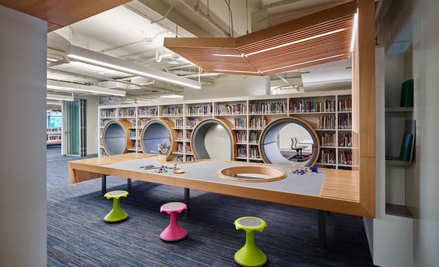
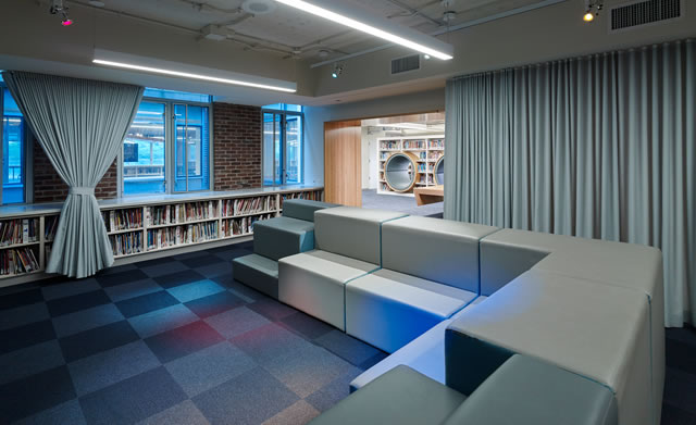
United by a composition of warm Beechwood and colorful tile volumes using the school's familiar campus palette, glazed group study rooms allow borrowed light to enter the space and pivoting writable, and retractable doors for impromptu learning moments separate the stacks and the Maker Lab. A story-telling room enclosed by acoustical drapery and dramatic lighting provides a setting for story and drama, and Reading Caves nestled among the books offers the opportunity for quiet study. All furnishings and book stacks are portable, allowing zones of quiet study and collaborative project space to be rapidly reconfigured to lecture, performance, or social settings.
The project is the result of an internal discussion among educational leadership regarding whether the existing library was fulfilling its role within the school community as vital support of the school's academic life and mission of cultivating authentic and engaged citizens. The key to this mission is the belief in project-based learning principles and their ability to unlock the joy of learning. Despite this progressive educational vision, the existing library was conventional in attitude in every way. Hidden behind a virtually solid corridor wall, it was not a destination nor deeply integrated into the school's broader academic life - more natural to walk past than enter in.
Isolated digital resources were behind glass within a formal computer lab, out-of-step with current student academic and research needs, and as importantly, not aligned with the nature of students' digital life. In this staid environment, the school's commitment to an engaging environment of interdisciplinary inquiry could not effectively take root, and a bold change was required.
For those that know this school's community and its vibrancy, the chasm between the project-based learning pedagogy and the library was wide and deep. To address this gap, the school hired 180 Studio, a lean education design collaborative to unwind past assumptions and weave a new story for the library. Their work included iterative workshops across the school's community and featured student voices from among those that weighed in. The final deliverable of this programming process was a conceptual space plan and a list of design imperatives that guided future development.
Fast-forwarding through the programming, design, and construction process, the final design that evolved from this beginning has had several global impacts on the school community.
Primary among these, the decision to eradicate the corridor wall has been vital in turning the library from a "sleepy" backwater hidden behind solid walls to a hub of student activity during the day and a destination for the broader school community beyond school hours. Without these boundaries and the invitation of a lush and thriving green wall and sculpture gallery, students flow freely in and out all day and enjoy a coffee while studying or lunch and research on the new east-facing terrace.
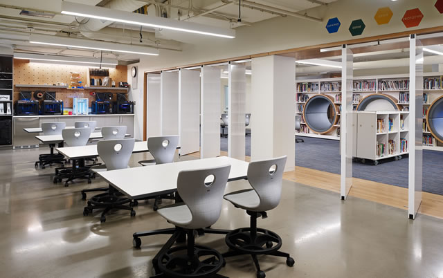
The new design studio, the TIDES Garage (Tides = Technology, Innovation, Design, and Entrepreneurship for Society) equipped with 3D printers, laser cutters, sewing machines, and a variety of technological tools for learning, challenge, and expression. Leveraging the principles of design-thinking, this lab provides access to the tools needed to link academic education and research with the tools required to tinker, test ideas, create and remake through rapid prototyping.
Readily reconfigurable, student teams explore concepts, build mastery, and develop skills to impact their school and their world as thinkers, doers, and makers. A completely mobile approach to furniture and technology coupled with several sets of glazed operable walls, now extend the relevancy of the space beyond library hours and for a wide variety of functions well beyond classic quiet study, concerts, lectures, and social services now add to the library's relevancy and further reinforce the interdisciplinary view of learning espoused by the school.
One-on-one post-occupancy client interviews solicited input on team performance and performance of specific design elements. These elements included but were not limited to flexible partitioning and furnishings, custom "Reading Caves" and Lego area, and regarding the elimination of the library checkout function.
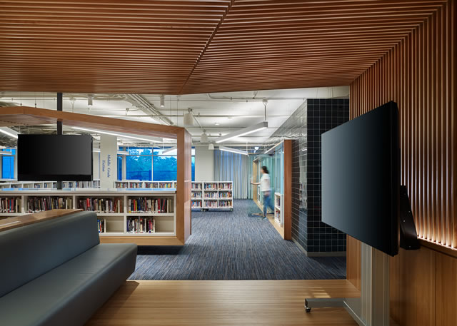
The provision of the operable partition systems was evaluated as incredibly successful on several accounts. First, the ability to merge the library with the corridor creates a compelling invitation to students that the library is not a book repository but a destination for all aspects of student life, academic, exploratory, social, and cultural. The operable partitions dividing the library into two areas provide space in tandem with a commitment to highly mobile furnishings that allows the library to host lectures or concerts while simultaneously maintaining space for essential library functions.
The custom-fabricated elements such as the Reading Caves and Lego Table were noted as successful in encouraging quiet study for those students seeking small scale space to do their work. While the Lego table fulfills the original support of curriculum centered on building, the school continues to find educational opportunities to integrate this area into learning moments.
It was shared that the key to the success of this renovation has been the willingness of the client to allow curriculum and pedagogy to drive functional space needs. That if you follow these, it pushes toward tailored solutions that will likely be successful. In Parker's case, these needs were immediately reinforced by new staff, which quickly worked to re-imagine the library's role and the need to open it up to the rest of the school both figuratively and physically.
"Radical nimbleness" is how one librarian described the attitude of the renovated library. This phrase aptly captures the vision of the space going forward as a hub of collaboration, exploration, and making and a destination for the enrichment and social connection.
The library is unique for its broad definition of learning and its intentional invitation to each student to come as they were made, as they are and learn. The design of the space and its features and the attitude of those who staff it reaches out and validates unique styles of learners and weaves them together into a unique learning tapestry that reflects the school's values.
Situated within an urban environment, issues of security and safety are a part of everyday life at the library and within the school. Integrating basic common-sense design supplemented by minimally invasive technology was an essential part of the design solution and afforded students, faculty, staff, and visitors the sense of safety needed to be useful in their studies and work.
The entrance to the library is now from a single location, where the former corridor wall used to be. With this wall eliminated, it was imperative to make sure that this entire opening was always observable. Though the book security system was omitted along with the centralized "command-and-control librarian desk," the open floor plan in tandem with mobile podiums for library staff set well into the space, provide uninterrupted views, and an immediate ability to react to security situations.
The larger space is subdivisible by operable partitions and has several smaller areas, which can be visually closed if needed. Maintaining the mental health of the school's students is enhanced through the design in a variety of ways. The entry to the library was converted into a habitable space that incorporates art, lush greenery, and comfortable lounge seating with abundant daylight and views into the central campus courtyard. By doing this, not only is the functional area of the library increased, but students can self-select their settings to suit their style of learning, mood, and mental state. Within the library, furnishings afford a variety of settings, extending students the choice to work in a livelier environment furnished with casual lounge seating up near the entry or in quieter areas further way and equipped with more traditional tables and chairs.
Individual sound-isolated spaces provide the option of private personal work or collective work for small teams. Because furnishings all have casters, the entire area is completely and rapidly reconfigurable by staff or students to accommodate the current need giving them necessary agency over their learning environment.
Architect(s):
Eckenhoff Saunders
MATTHEW J. WYLIE, AIA,
NCARB, LEED AP
312-786-1204