Sunnyvale Intermediate School
WRA Architects
Project of Distinction 2020 Education Design Showcase
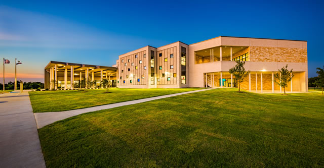
photo © ICE Imaging/Kevin Halliburton
Project Information
Facility Use: Elementary School
Project Type: New Construction
Category: Whole Building/Campus Design
Location: Sunnyvale, TX
District/Inst.: Sunnyvale Independent School District
Chief Administrator: Doug Williams, Superintendent of Schools
Completion Date: August 1, 2019
Gross Area: 74,941 sq. ft.
Area Per Student: 125 sq. ft.
Site Size: 12 acres
Current Enrollment: 464
Capacity: 600
Cost per Student: $30,583
Cost per Sq. Ft.: $245
Total Cost: $18,350,000
It has been several years now since Sunnyvale Independent School District made the decision to abandon the
notion of "teaching to the test" and with it, the practice of teaching students sitting in rows in individual classrooms.
As this decision was implemented in the District's three school buildings – elementary, middle, and high schools –
the corridor serving a wing of classrooms took on an active role in student learning over the course of each school
day. These hallways were certainly not ideal venues for the individual and small group activities taking place in
them – the ceramic tile floors were hard and cold, and the limited amount of glass in the walls between corridor and
classrooms made for difficult oversight by the teachers. Simply placing furniture in them wasn't wise as the
corridors were still filled with students during passing periods. But teachers are known for making the best of any
situation and weren't deterred by the limitations of the space. Instead, they forged ahead with the fluid and
collaborative approach to learning that they were undertaking, no doubt energized by the enthusiasm – and success –
they were witnessing in their students.
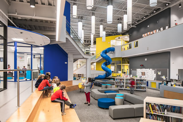
photo © Parrish Ruiz de Velasco
In 2014, when it was time to add new instructional space at the District's growing middle school – now eight
years old and the oldest of the District's school buildings - the District seized the opportunity to create in this new
construction the sort of environment that would truly respond to the educational transformation that was taking place
in Sunnyvale. Designed primarily for the school's fifth grade, the new addition comprised twelve classrooms, a
STEAM lab and maker space all opening onto a large daylit Common space. Glass overhead doors open the
classrooms up to the Commons. Comfortable and flexible furniture, along with lots of technology, fill the
classrooms and the Commons. Visitors to the space are invariably struck by the number of kids in the space,
working alone or in small groups, completely unphased by, and oblivious to, visitors and other potential distractions. More often than not, the overhead doors are open, with students and teachers alike moving freely between classroom and Commons, laptops in hand.
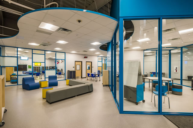
photo © ICE Imaging/Kevin Halliburton
The decision to implement an architectural response to Sunnyvale's instructional model at the middle school,
specifically for the fifth grade, was intentional and strategic. Knowing that student population was growing at all
grade levels and the elementary school in particular was nearing capacity, the next new campus in the District's
master plan was an intermediate school for grades 3 through 5. Armed with the success of the middle school
addition, the district approached the design of the new intermediate school with an even more aggressive expectation
that the building as a whole respond to and support the learning experience of a Sunnyvale student. The intermediate
school's grade configuration of 3 through 5 enables the District to pull 5th grade out of middle school – typically a
somewhat controversial inclusion – and it allowed them to extend this learning experience out to three additional
grades, all preparing kids leaving the intermediate school for the environment that they would encounter upon
entering middle school.
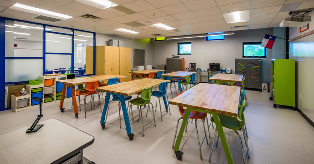
photo © ICE Imaging/Kevin Halliburton
After first crafting a basic program, the Architect facilitated a design charrette with teachers, students, and
parents as active participants. A highly interactive dialog between the design team and the stakeholders built upon
the valuable input generated by the charrette. The foundational decisions that subsequently drove the design include
the following: The school would hold up to 600 students in grades 3, 4, and 5, and would be subdivided into three
small learning communities (SLCs). However, the SLCs would not be identified by individual grade level. Instead,
each SLC would have students from all three grades, and that group of students would stay together in their SLC, or
House, for their entire career in this school, rather like Hogwarts. In addition, a small site coupled with very poor
soil conditions that required an expensive foundation system drove the decision for a two-story solution.
In the resulting design, each SLC includes nine classrooms on two floors along with breakout spaces and small
group rooms. Each SLC is identified by a brightly colored two-story tower that connects to, and overlooks, the open
Media Center / Commons that is the hub of the building's academic wing. Dedicated spaces for Art, Science, Special
Education, as well as a Maker Space also open onto the Commons, reinforcing the sense of community that the
District was striving to achieve in this building.
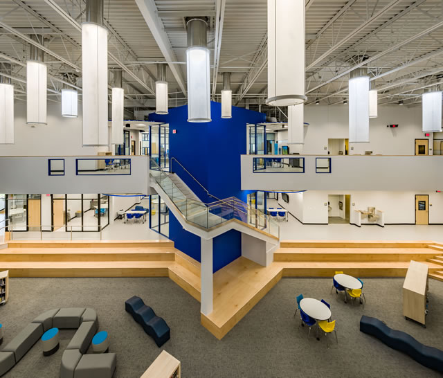
photo © ICE Imaging/Kevin Halliburton
The absence of corridors along with ample walls of glass allow virtually every corner of the Commons and
learning communities to be easily overseen and, as a result, to serve as effective areas for learning. Most walls in the
collaboration spaces and in classrooms are writable, as are the many areas of glass. Students from a wide range of
learning styles can find their favorite spot among the many different spaces to be found here.
In the earlier addition to the middle school, the Architect included an outdoor Amphitheater to more gracefully
and usefully manage a significant grade transition on the site. That proved to be so popular with students, that in this
new intermediate school, the design more intentionally included multiple covered outdoor spaces. These outdoor
areas are on both the ground floor and second floor and are more easily accessed and monitored, enhancing their
usefulness as outdoor learning spaces. As an additional outdoor learning area, the school's main entrance plaza is a
large, covered space with a "forest" of columns of different sizes, adding to the outdoor opportunities for student
engagement.
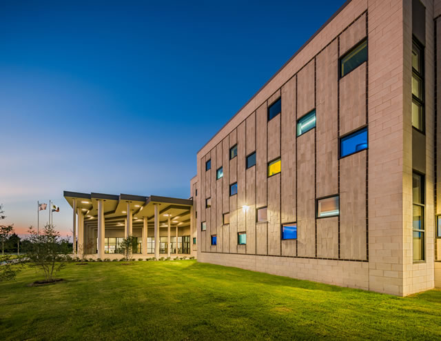
photo © ICE Imaging/Kevin Halliburton
Safety and Security Considerations
The District's educational objectives rely on a high level of transparency – literally, as in lots of glass. This,
coupled with the community focus of the SLC model, is intended to make a stranger in the building stand out. This
is one component of the Owner's security strategy. Others include a direct visual connection between the
Administration offices and the entrance plaza, a limited number of exterior doors from the classroom building, and a
single connection between the classroom building and the rest of the school that is protected by an automated security door. This feature also facilitates easy after-hours use of the building's public spaces (Gymnasium and
Cafeteria).
Each floor of each SLC includes two classrooms that have, because of their corner position, lesser visual
connection to the collaboration space and serve as safe rooms in the event of a shelter-in-place scenario. And lastly,
the Gymnasium is constructed as an EF-5 Tornado Shelter designed to withstand 250 mph winds.
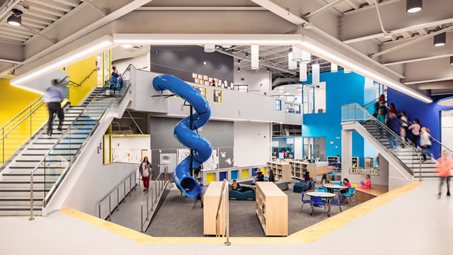
photo © Parrish Ruiz de Velasco
Site Considerations and Solutions/Sustainability and Environmental Considerations
In addition to its having driven the decision for a two-story building, the orientation and topography of the site
were also highly influential in the design. The narrow East-West dimension of the site forced a North-South
orientation of the building, with long eastern and western exposures that are unfortunately less desirable in the Texas
sun. North- and South-facing classroom walls, though limited, are full glass, while the large east and west walls are
punctuated with small windows of brightly colored glass, lending color to the interiors during the day and a lantern
effect at night.
The interior Commons space is filled with daylight by Solatubes that eliminate the need for artificial light even
on overcast days.
The natural slope of the site was sufficient to warrant stepping the floor levels down across the first floor of the
academic building. This became an asset in helping identify and distinguish the three small learning communities. In
addition, the site grade transitions created natural locations for lLearning Stairs and help in defining the Commons
space from the surrounding SLCs. For structural and circulation simplicity, the second story is all on one level,
creating a variety of ceiling heights on the first floor below.
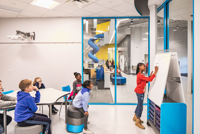
photo © Parrish Ruiz de Velasco
Material Choices and Rationales
All of the school district's buildings are on a single 100-acre campus, and the exterior material palette was set
with the first school constructed in 2006: native limestone, burnished concrete masonry, and charcoal gray metal
accents. This theme, applied in different ways, has been carried through all of the District's schools, including this
new intermediate school.
Interior finishes, on the other hand, reflect a departure from those of the other schools, with a focus on more "touch-friendly" selections, such as LVT and carpet flooring, IdeaPaint writable walls, a minimum of ceramic tile,
and limited to food service and restroom areas. A visitor to the school is certain to see students everywhere, sitting
on floors, writing on walls, truly "engaging" with the building as they work through problems and projects.
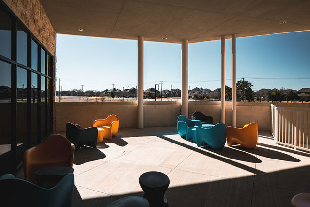
photo © Parrish Ruiz de Velasco
Unique Features and Special Challenges
Needless to say, the construction budget for this school, like that of most public school projects, did not match
the Owner's dreams for all that this building could be. The design team, with the Owner, chose to prioritize space
over finish. And while the bright colors and wood accents effectively catch the eye and help define and enliven the
spaces, they are not costly.
What is less apparent to the observer, but now very clear to the students and teachers, is that aside from the
building's entrance vestibule, there is no space in the school that serves only as a circulation path. Truly every corner
of the building can be, and is, used for student activity and instruction of some sort. This is the subtlety that might
well be the greatest asset of Sunnyvale Intermediate School.
Architect(s):
WRA Architects
WESTON EMMERT, AIA, NCARB
214-750-0077