Sanchez Elementary School Modernization
McKinney York Architects
Project of Distinction 2022 Education Design Showcase

Project Information
Facility Use: Elementary School
Project Type: Renovation / Modernization
Category: Whole Building / Campus Design
Location: Austin, TX
District/Inst.: Austin Independent School District
Chief Administrator: Anthony Mays, Superintendent
Completion Date: December 2021
Gross Area: 80,341 sq. ft.
Area Per Student: 154 sq. ft.
Site Size: 9.3 acres
Current Enrollment: 428 students
Capacity: 522 students
Cost per Student: $41,828
Cost per Sq. Ft.: $272
Total Cost: $21,834,677

One block east of Interstate Highway 35 and a few blocks north of Lady Bird Lake in downtown Austin, a small neighborhood elementary school has undergone a transformational renovation, decisively renewed without leaving the community’s historic roots and values behind.
Pursuant to a voter-approved 2017 bond proposal, Austin Independent School District (AISD) invested approximately $25 million in the future of this east Austin school. Originally built in 1976 and named after Dr. George I. Sánchez, a pioneer in bilingual education, the 80,000 square-foot modernized school is designed to serve a little over 500 elementary students.
Community Engagement as the Foundation
Working with a diverse community within a rapidly growing city, McKinney York Architects, including Project Principal Michelle Rossomando, AIA, RID; Project Architect Navvab Taylor, AIA, RID, LEED AP BD+C; and Project Manager Patricia Hunt, AIA, RID, LEED AP, spearheaded intensive dialogue sessions with community stakeholders to enable all parties to contribute to the vision for the future of Sánchez Elementary.
Throughout the design process, McKinney York led dual language community meetings, envisioning exercises, listening sessions, and surveys with groups of stakeholders including teachers, parents, and community members.
“Community engagement made the entire project so much better. The end result would not have had the richness or authenticity without the community’s guidance and input,” reflects Rossomando, president of the firm.
Drew Johnson, AISD Director of Bond Planning and Project Controls, added that “[McKinney York’s] ability to slow down, engage the community and listen, learn, contemplate, wonder… much of that groundwork is the cause for the success of the project.”

A Transformational Renovation
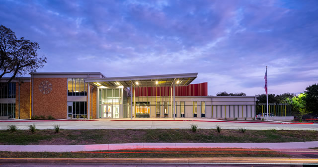
With the school’s main entrance facing toward the city, there was the sense that the original edifice turned its back to the families it served. Reprogramming resulted in orienting the official public-facing uses toward the west side of the school, while more intimate, community-focused spaces were accessible by the neighborhood to the east. Taylor reiterates that “While the formal entrance faces the city, friends and family come in through the informal entrance on the community side, which faces east to the residential neighborhood.”
The architects realigned the main entry location and reconfigured the main circulation spine to connect the primary communal gathering spaces — dining, fitness, Learning Stair, library — and extended it outward to culminate in welcoming canopies at the East and West entries. The internal reorganization of the building also allowed the design team to combine previously disjointed exterior play and activity areas, improving access to the outdoor spaces.
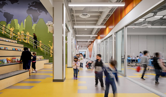
An underutilized internal courtyard was repurposed into a Learning Stair, now a vibrant gathering space at the heart of the school. This newfound space extends the seating capacity of the dining area for community wide events, while also providing a direct connection to the upper grade-level learning areas and library.
Slithering down the main corridor of the school between the east and west entries is an undulating, striped, slatted wall inspired by a double-headed serpent. Coiling around the community gathering spaces and topping out at the roof, the decorative element serves as a billboard for the modernized Sánchez Elementary. Like a snake that has shed its skin, Sánchez Elementary has been physically renewed with a heart that remains connected to the history and heritage of the community.

Maintaining Past Investment
Part of McKinney York’s programming strategy was to take advantage of the existing “embedded value” and keep the kitchen, dining, and fitness spaces in the same locations as in the original school. This pragmatic approach takes advantage of the existing structure and infrastructure and helps keep costs down. Hunt asserts that, “In the renovation of a building you can make good use of the school district’s previous investment, while providing communities a fully modernized facility.” Building reuse is also a highly sustainable tactic which reduces embodied carbon emissions.
AISD’s Johnson concurs: “I appreciate [McKinney York’s] commitment to schedule and budget. They are able to handle highly technical things but also appropriately spent money and time on softer things that make a difference. They got the dollars and cents thing right.”
Creating a Sense of Place
A significant challenge in the renovation was to create a modern learning environment that embraced the community’s historic roots and values in a meaningful way. McKinney York responded with an inclusive design that incorporated the bilingual Spanish-English culture and honored the past while looking forward to the future.
As Rossomando emphasizes, “We utilized design elements such as color and pattern to instill the modernized school with the history and heritage of the community while at the same time being sustainable and staying within budget.”

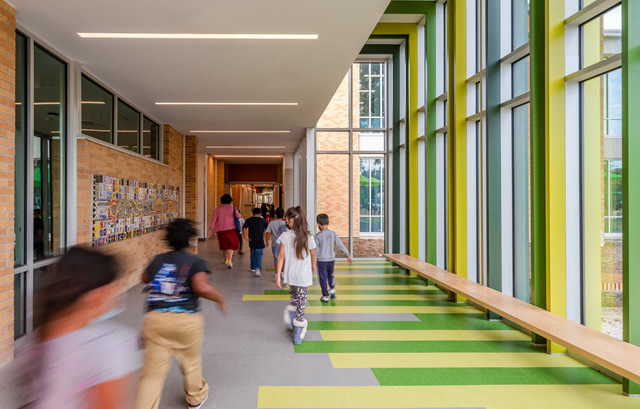
Strategic use of colors, patterns, and geometry helps create a sense of place throughout the school. McKinney York incorporated natural colors layered against a neutral backdrop, and employed color blocking to define different program areas, accentuate points of entry, and articulate circulation paths. Rich iconography was used in room signage and wayfinding, as seen in the scrolled serpent floor pattern in the dining area, which recalls a feature from the original building. The risers of the Learning Stair display virtue words in both English and Spanish, while room signage for communal gathering spaces employs three languages — Spanish, English, and Braille — in addition to colorful pictographs and the serpent motif.
Hexagons, another symbol from the original school that was carried forward, form the ceiling of the dining area and flow through the Learning Stair, culminating in the Library ceiling. There, hexagons in the millwork form cozy reading nooks, while other hexagonal niches are used to display cultural artifacts and artwork from throughout the school’s history. The consistent application of these design elements help form a cohesive, whole-school identity. The design also incorporated original mosaic artworks and monumental-scale painted murals that were of importance to the community.
Johnson acknowledges: “McKinney York honored some of the cultural aspects, some of the historical components, but still pushed the project forward into modernization.”
As illustrated by the new graphic design on the wall of the Learning Stair, the students at Sánchez Elementary are leading the way into the future with a strong and influential community supporting them at every step.

Architect(s):
McKinney York Architects
Navvab Taylor, AIA, RID, LEED AP BD+C
512-476-0201