Fletcher Administration Building
O'Connell Robertson
Grand Prize 2023 Education Design Showcase
Project Information

Facility Use: Higher Education 2-Year Institution
Project Type: Renovation / Modernization
Category: Administrative and Office
Location: Texas
District/Inst.: San Antonio College
Chief Administrator: Dr. Naydeen González-De Jesús
Completion Date: 07/12/2022
Gross Area: 59,000 sq. ft.
Area Per Student: 67 sq. ft.
Site Size: 2.12 acres
Current Enrollment: N/A
Capacity: 882
Cost per Student: $314.44
Cost per Sq. Ft.: $21,034
Total Cost: $18,552,000
The San Antonio College (SAC) Fletcher Administration Building (Fletcher) renovation rejuvenated the heart of this community college campus. The project reimagined and revolutionized the way administrative student services were delivered by creating a space that puts students first and allows staff members to serve as expert guides.
SAC's student population is primarily non-traditional students that vary widely in their age, goals, and comfort with technology. The goal of the renovation was to deliver a modern, tech-enabled building that is welcoming, accessible, and easy for all students to navigate on their own terms.
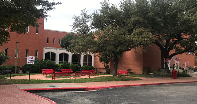
Fletcher Administration Building entrance before
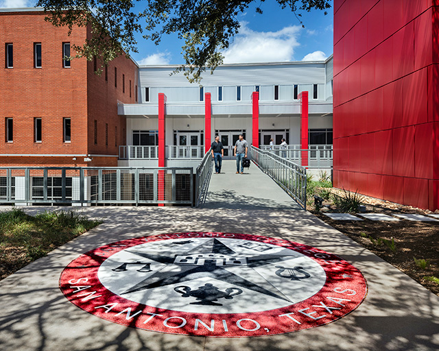
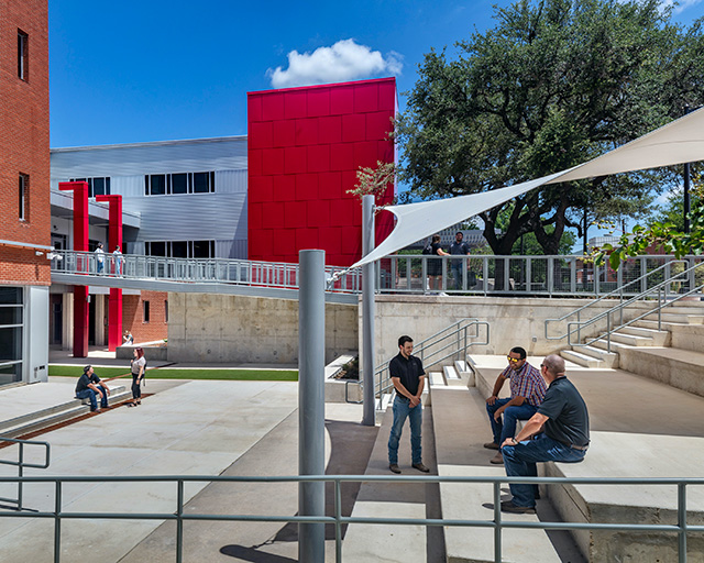
Fletcher Administration Building entrance after
How It Started
The plan to redesign Fletcher and the way it provides student services began in 2017 when the team developed a master plan for the college. This relocated the main entrance of the campus, placing Fletcher in a more prominent location. With additional prominence, it was important to the staff that Fletcher become a one-stop-shop for student services and a welcoming introduction to the college.
At the start of the project, the team revisited the master plan along with the building program from SAC's program management firm. The biggest challenge of the project was that the building program exceeded what the space could support. The team realized that certain goals could not be accomplished within the project budget. The plan for a 4th floor Conferencing Center was eliminated. Design was approached with a conscientious eye toward scope. This led the team to incorporate alternate options for SAC to pursue should additional resources become available. For example, SAC was able to raise additional funds to add a warming kitchen to the 1st floor multi-purpose room for conferences and events.
In order to accommodate as many of the intended functions as possible within the existing budget, the team worked closely with the college president, leadership, and department stakeholders to diagram the relationships and flow for each space and department. This allowed the team to identify opportunities for shared spaces, refine the scope of the project and reduce the area they were building while including more of the extensive program requirements.
Student spaces were prioritized and office spaces were streamlined and consolidated. Based on an open-office model, work areas became more integrated into the floor plan and closed offices were narrowed down to key functions in need of private spaces.
The stakeholder group was very engaged, participating in charrettes and dot exercises to identify the right character for the building and what design features would make students feel most welcomed. The design team vetted and fine-tuned floor plans with department heads to support their services to students.
The project was delivered in conjunction with Vaughn Construction, the Construction Manager at Risk. They had been involved on several previous SAC projects, so their campus knowledge and early inclusion in the process helped identify cost implications while in schematic design. This allowed for cost savings to remain in line with the budget. The close partnership between planning, design, construction, and stakeholders allowed for a smooth and successful project.
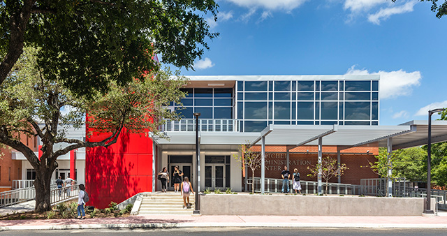
How Fletcher Was Reinvented
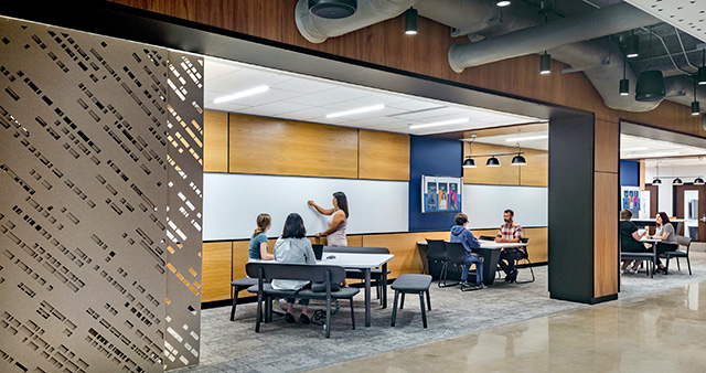
The 59,000 SF 3-story building is unique because the primary entrance to the building is on the 2nd floor, with a basement-like 1st floor and below-grade patio. The original entrance was hidden and uninviting. A light, minimalistic pedestrian bridge was designed to lead students directly into the heart of the building through the entrance on the second floor, where they are met by greeters to welcome and triage needs. Advisors then come to the students (from offices on the perimeter in a back-of-house area) and meet in an advising space that best suits the student's needs. The 2nd floor provides different areas ranging in level of privacy, flexibility, and technology to accommodate a variety of scenarios.
The 1st floor was given a bright and modern look to make the testing, lounge, and patio areas more inviting. Prior to the renovation, the sunken patio area underneath the pedestrian bridge was dark and unwelcoming. Increasing the light and improving visibility for occupants and pedestrians made this space safer. The sunken patio area was opened up into an outdoor learning and gathering space for students, enhancing its function.
The 3rd floor houses the President's office and conference rooms. It was reconfigured as an open space to welcome students and visitors to campus and features design elements distinctive to the college, including the signature SAC red brick.
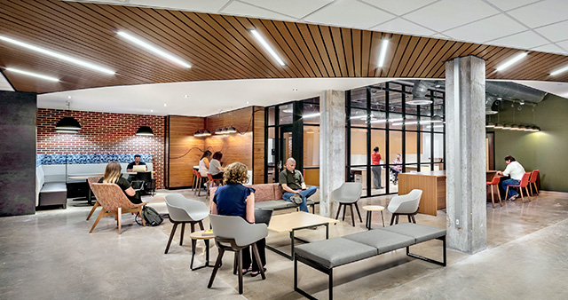
Furniture selection was made with deep appreciation and understanding for a population of non-traditional post-secondary students. A variety of table heights and seating arrangements were chosen with accessibility in mind to create comfortable areas for students of all sizes and capabilities. Technology was also a key element of furniture selection to ensure that power sources were available for student devices.
The design makes provisions for both collaboration and privacy. Group seating and writable surfaces ensure collaborative spaces are approachable, while movable wall panels, conference rooms, and offices provide areas for conversation about more sensitive topics.
Integrated technology, in combination with highly visible building personnel, ensures that wayfinding is easy. Staff members are immediately available to assist or provide directions for individuals that are less tech savvy. Distinctive design elements, like glass walls and curved uplighting, create additional wayfinding reference points.
The renovation involved extensive planning and coordination around technology to revolutionize the way student services were administered. The team coordinated with SAC IT staff throughout the project to ensure the self-serve kiosks, digital wayfinding screens, and message screens for group training and private meeting areas functioned seamlessly.
Sustainable design elements include high efficiency LED light fixtures and occupancy sensors. Improved ventilation from the new high-performance HVAC system, and enhanced daylighting with controllable window shades have a positive impact on occupant well-being.
Exterior improvements were carefully selected for maximum impact. The outdoor learning area and entrance were prioritized while other elevations were left alone. Upgraded metal panels were installed to give the building a more modern feel that better represented the future of the campus.
All three floors minimize the sense of hierarchy with exposed finishes and more casual desks and counters to eliminate barriers. It was important to the team to honor the original materials and history of the building while also looking to the future. The SAC red brick was maintained on the exterior. The sections of brick that were demolished in the construction of the outdoor student area were repurposed on the interior of the building as a tribute to the school's history and identity.
The combination of exposed original building elements and deliberately selected finishes creates a sense of welcome. Saturated colors, intermingled patterns and texture, intentional lighting, and technology integration are all designed to build on the themes of diversity and belonging.
From conception to completion, SAC's vision to better serve students by eliminating barriers to success provided the guide to create an environment as diverse as the population it serves.
Architect(s):
O'Connell Robertson
Misela Gonzales-Vandewalle, AIA - Senior Associate
713-487-1583