Rocky Top Dining Hall
Johnson Architecture Inc.
Project of Distinction 2023 Education Design Showcase
Project Information
Facility Use: College/University 4-Year Institution
Project Type: New Construction
Category: Dining and Food Service
Location: Tennessee
District/Inst.: University of Tennessee, Knoxville
Chief Administrator: Andrew P. Powers, AIA; Campus Architect
Completion Date: 05/28/2021
Gross Area: 87,328 sq. ft.
Area Per Student: 65 sq. ft.
Site Size: 2.5 acres
Current Enrollment: N/A
Capacity: 3,000
Cost per Student: $1,528.28
Cost per Sq. Ft.: $487.09
Total Cost: $42,536,271.11
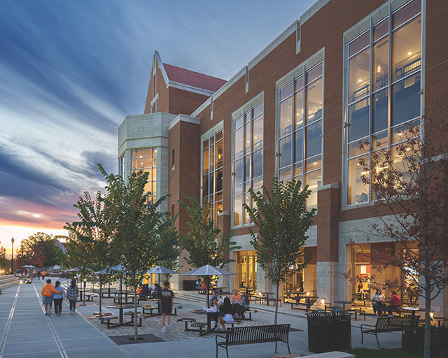
The new Rocky Top Dining Hall facility serves as the student "living room" as part of the West Campus Redevelopment Plan. The design team integrated a progressive food preparation strategy supporting a 1,200-seat dining hall with nine distinct food platforms, generous outdoor dining options, campus bakery, Chick-fil-A restaurant and 24/7 convenience store – all woven within the prerequisite campus "Collegiate Gothic" architectural vocabulary.
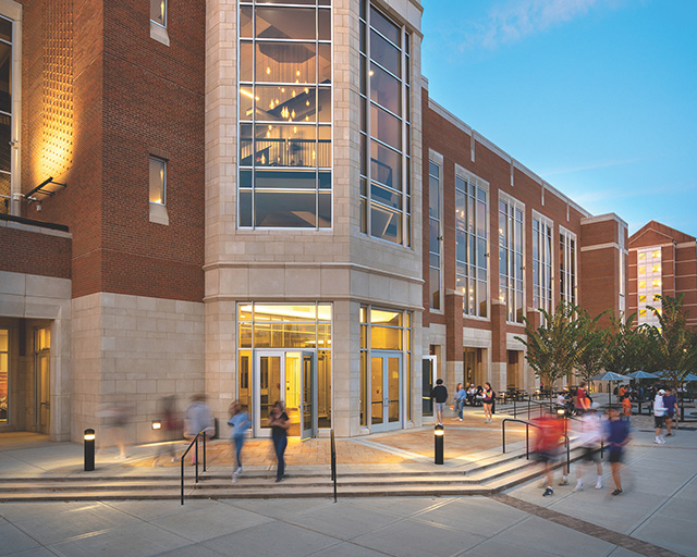
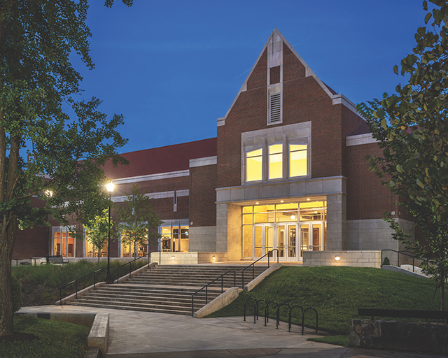
The prime directive for the facility was to provide an accessible link from the dormitories at the higher elevation of West Campus, down to the Johnson Ward Pedestrian Mall, and on to classes and recreation facilities to the south and east. As students pass through the building, linking the residential courtyard and the pedestrian mall, they are enticed by the availability of convenient, freshly cooked meals throughout the day.
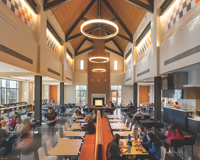
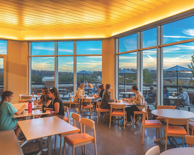
The building provides four open and airy, yet card-secured, dining rooms allowing users full access to all food platforms on two levels. The principal dining room boasts a 50-foot vaulted ceiling with exposed brick chimney and fireplace with lounge seating, while additionally offering an intimate outdoor dining balcony overlooking an even more generous dining terrace with a sunroom enjoying views of western skies.
The architect carefully curated a design team of highly specialized consultants with extensive experience in higher education dining facilities. This integrated team provided a comprehensive and coordinated design that illustrates the challenges inherent to a three-story food service facility many times larger and vastly advanced than what it replaced, while connecting two disparate pedestrian traffic patterns between a monumental elevation drop.
Rocky Top Dining serves not only as the main campus residential dining center, but also in essence functions as a machine for creating and distributing healthy and diverse meals from breakfast to dinner for thousands of daily users. This collaboration markedly synthesizes a collection of exacting yet contradicting needs, including: a dozen small restaurants with dedicated preparation areas; corporate restaurant; convenience store; and a lower-level bakery geared for churning out mass quantities of baked goods distributed throughout the entire campus via a loading dock and its team of electric delivery vehicles and robots.
Balancing all this with budget, security, accessibility and vast food stores and maneuvering around major paths of public travel through multiple levels of secured meal plan spaces could only be resolved through parallel finessing among all consulting design teams.
The construction team navigated multiple site sinkholes and monitored the 30-foot excavation site between two existing structures, including a high-rise dormitory. The entire foundation is anchored by 125, 3-foot diameter caissons installed up to 80 feet into the ground before construction could even begin. Acute budget constraints dominated this project's every move from day one, forcing justification for every decision or change from underground to the apex of the roof.
Campus standard finish expectations were purposefully cross-examined with iconic and recent campus structures for longevity, presentation and value. Settling on the simplest versions of each detail or element helped to reinforce a harmony between quality and cost. The design team culled and streamlined some of the more complicated design elements from prior projects, historic and contemporary, toward more well-ordered and uncluttered elevations.
Of the many factors that influenced project decision making, the most important included maintaining campus identity, including open space and efficient pedestrian flow, supplying safety and security, enhancing space utilization and ensuring effective access to and from the building.
The design team received the following campus administration directive: "If blindly placed in this location and asked to identify where they are, one should sense an immediate and identifiable link to this campus." Ensuring all students have easy access to the plethora of platform options within the card-secured areas with a thoughtful array of seating options makes for a comfortable, durable, congruous and handsome structure befitting both the natural and built surroundings of this historic yet modern campus with all four dining rooms overlooking the pedestrian mall and practice fields and beyond to the Great Smoky Mountains.
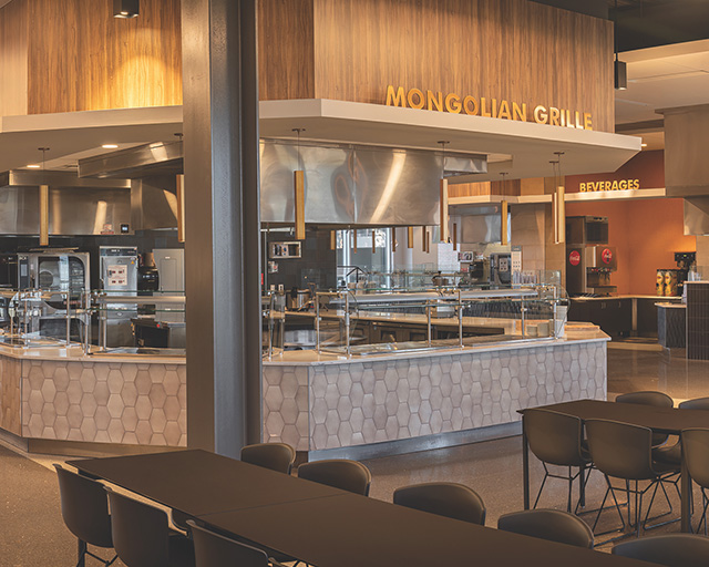
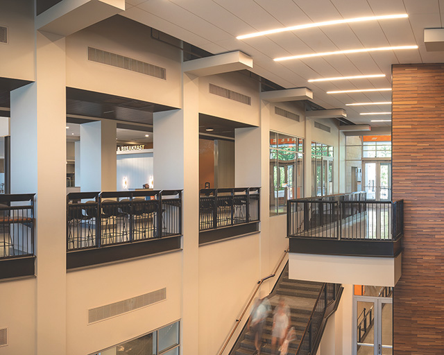
The design team linked interior and exterior spaces of the building with neighboring architecture and public squares, engaging open air loggias and dining terraces on all levels to encourage pedestrian paths, so intuitively it feels as though it's always been here. The building's core circulation spine promotes pleasant and accessible access for students between West Campus housing and the rest of the campus via the newly extended Johnson Ward Pedestrian Mall. This open but directive design concentrates travel paths through aromatic hints of freshly cooked meals as students circulate through the building on their way to and from campus life.
Alternative and thoughtful food preparation methodologies were engaged throughout the process to best provide 3,000 safe meals daily. To prevent burns, the entrée and sauté platforms utilize custom induction "fire and ice stations." Temperature-controlled cold prep room, alternate platform preparation areas and an autonomous special diet prep area combine to limit cross-contamination of food. The design team intentionally located and constricted a singular but generous portal for the card swipe queue line on the second level so no student travels more than one level up or down on the way to and from classes and dorms.
Interesting space utilizations include:
- Upper-level dining rooms and sunroom open to dining terraces with expansive views.
- Interior iron railings feature inward-sloping guardrail caps and reading shelves so placed items don't fall outward.
- ADA-compliant seating is integrated among all dining spaces.
- Concentrating the most popular platforms together on one level allows staff easy means of controlling low-demand periods, closings, and summer camps.
- Ice cream stations host integral faucets for easy cleaning.
- Design intentionally elevates all student spaces so diners can enjoy bright, broad views from nearly every seat.
- Locating shielded loading dock on east end allows student-populated spaces to have sunset views to the west.
The south entrance was intentionally articulated as a bay, thrusting all three sets of access doors out to align intuitively with the broad, landscaped and zig-zagging pedestrian mall. This approach collects students' paths toward the dining hall's apron running through the building and reconnecting to the residential presidential courtyard. Conversely, corralling back-of-house support services into a well-appointed loading dock, screened with foliage and a detailed masonry screen wall, restrict any off-putting smells and visual clutter. The card-secured outdoor dining terraces and balconies feel open and airy, overlooking the mall, practice fields and mountains beyond.
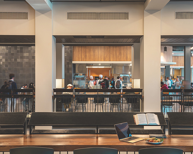
The 87,328-square-foot, three-story dining facility was completed on schedule in 700 construction days during a global pandemic. It is wrapped in an all-masonry skin and designed to easily serve 3,000 students daily for a 50-year building life span. Combining high bay volumes with an integral but passive smoke ventilation system, which utilizes convection in the event of fire to move smoke up and away from the users, allows time for safe egress if ever needed. This orchestration of architecture and engineering allowed the design team the often-rare luxury to maintain all public spaces as open and airy volumes on all levels.
Incorporating a transitional window-film system decreases interior glare on users while also controlling UV radiation heat loads on the mechanical systems, as well as the breakdown of interior finishes. The campus' intense recycling program reuses food waste as fertilizer for farms within the university system.
Landscaping is zone-appropriate for maximizing water efficiency while all outdoor dining areas offer nearby trees for shade and comfort as they grow. Generous dish-pits throughout the facility process thousands of dirty dishes daily. These specialized dishwashers host heat recovery systems allowing units to condense steam exhaust and pre-heat incoming cold water instead of constant hot water use.
Architect(s):
Johnson Architecture Inc.
Partner in Charge - Design: Daryl Johnson, AIA; Partner in Charge - Production: Rick Friel, AIA; Project Designer: Brian Pittman
865-671-9060